The Boston Globe Design System
Summary
I joined The Boston Globe in August 2021 as their first in-house UI & UX designer. I worked directly with the Head of Product Design and the graphic designer to tackle the user experience and interface of The Boston Globe and the Boston.com platform.
Before I joined the Product and Design Team at The Boston Globe, I was onboarded on the branding with an Excel sheet and Sketch. Thus, one of the critical tasks I wanted to tackle was setting up and managing a new Design System.
Scope and Consideration
Working as a solo designer meant I had limited time to develop the Design System alongside other rapid UX work. The Design System had to scale fast, so I approached this challenge strategically. I had to work quickly as I discovered new use cases and constantly rethought and expanded the library.
Working with our graphic designer and front-end engineers, I established a set of short-term and long-term priorities. Rapid scalability and modularity were some of the guiding principles.
Not Just a Set of Components
Working with the Director of Product and Design, we ensured user research was baked into the Design System and organized prototype usability studies and other discovery exercises. These helped drive the development of the component library and interaction patterns.
Laying the Foundations
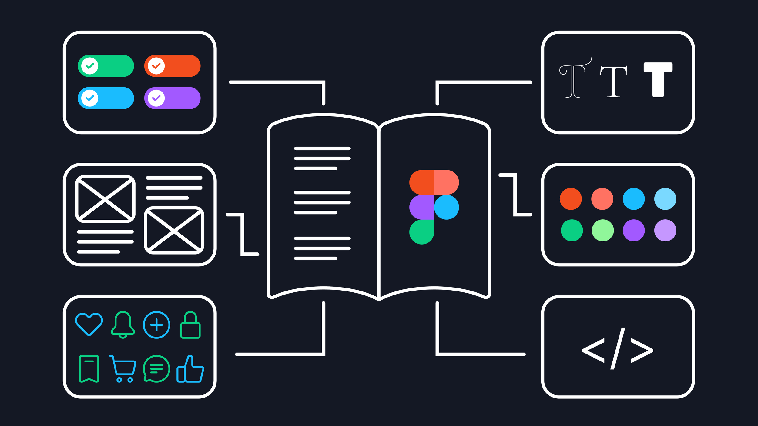
One of the first tasks was collecting the typography and our color palette. While gathering all the colors and typographies, I aimed to ensure consistency across the brand.
I proceeded to set up the foundations with a series of page templates. Following the UX best practices, I explored a few approaches to information architecture, navigation, and sidebar options. Working with the front-end engineers, we defined the grid for key breakpoints.
The next step was to start on an ever-developing set of components. Continuously working with developers and my fellow designer, we ensured that naming conventions and component organization worked for both sides: the Design System was mirrored in the Storybook, which streamlined the process.
Accessibility Baked Into the Process
The opportunity to build a Design System from scratch meant that accessibility became part of the process rather than an afterthought.
Some of the fundamental principles taken into account were:
Checking color contrast on different backgrounds and across different interaction states (this included me going down a deep rabbit hole of accessibility standards for disabled buttons).
Ensuring font size + touch targets on mobile are appropriate.
Include text labels with icons on mobile navigation.
Consistency across layouts and similar UI elements.
There is room for improvement, as trade-offs have to be made, and time to ensure all standards are met is limited, but it sets us up on the right path and ensures that adherence to accessibility standards is a shared mission.
Pragmatic Creativity
Pragmatic creativity is a concept I borrowed from BBC’s Design System; it resonates well with my approach to working on the Design System. When iterating on some of the more complex screens, I occasionally had to step away from the established set of rules to think creatively. This could mean adding new components or re-evaluating certain existing patterns. It was important to be pragmatic about when to be flexible and add a splash of something new to the system.
Asynchronous communication
A set of components is not enough to maintain a successful Design System; there needs to be enough context to make it accessible to a range of internal users. I aimed where possible to:
provide rationale behind my design decisions (in conversations with the Leadership team)
showcase behaviors, interactions, and various states (in handover for the developers)
cite research sources and alternatives considered (for future designers and the wider Product team)
While we had weekly grooming meetings with the Head of Product and the developers, there was not enough time to discuss all the interaction details. In a fully remote team, asynchronous communication is critical. I wanted to provide the necessary context around designs without creating yet another document that people dread.
Therefore, my handovers consisted of contextual notes in Figma files, video walkthroughs of specific interactions or more complex flows, and visualizations of expected behaviors in static files. Furthermore, when new components were added to the library, I linked the screens to the set of components so developers always have access to the source of truth.
Results
In under two months, I produced a design component in InVision. The Design System played a crucial role in ensuring a successful launch:
It provided a cohesive look and feel for the rebrand.
It gave me a structure and a set of principles to return to when making decisions on sometimes conflicting requests from the wider team.
It streamlined the design process, which was vital for a solo designer.
It led to a faster design to market time, providing developers with a single source of truth and reusable components and patterns.

