Fandango
A Classic Duo: Movies and Popcorn
Overview
My team proposed that Fandango's mobile app add live events - concerts, theater and sports - to their inventory.
The Client
The Planning & Process
Discovery
We performed competitive analysis, contextual inquiry, and user research to identify what was important to users and what competitors are doing (well and not-so-well)
Creation
We brainstormed, journey-mapped, and iterated on user flows for purchasing both concert and sports tickets.
Testing
We produced a high fidelity, clickable prototype, then placed it in front of users, again, for testing. We also asked testers to fill out a System Usability Scale survey to collect additional data about our design.
Discovery

Iteration
We produced paper prototypes and tested these with users, identifying opportunities for improvement and validating design decisions.
Competitive Analysis
We began with an analysis of Fandango's major competitors in the Live Event ticketing space. Competitors were selected based on their market penetration, our familiarity with them, and mentions from our early interview subjects. We analyzed each site's user flow and mission, and were able to put together an in-depth heuristic analysis to identify what each site did well, and where we might be able to do better.

Heuristic Analysis Highlights
Ticketmaster - Upcoming event, favorite options
Eventbrite - Multiple categories showing, ticket sharing
SeatGeek - Tracking, Clear Menus of each screen
Gametime - Picture of seat, ticket sharing, what's happening (today, tomorrow )


Iteration
Client
Fandango
My Role
UX & UI Designer
Team
3 person team - all ux designers
Year
November 2018 - 2 week sprint
Fandango is one of the largest players in the world of online movie ticket purchasing. With deep market penetration across the US, they are a go-to resource for customers looking to quickly locate and buy movie tickets online.
Integrating live event ticket sales into Fandango’s existing model presented a challenge as the proposed additions came with a unique set of problems. Seat selection, scheduling, and variety of event type all represented opportunities for improvement and change.
After a review of the brief, our team brainstorm, and our user research and competitive analysis, we chose to focus our campaign on three areas:
Ticket management
Event Browsing
Shopping Experience
Research & Planning

Survey
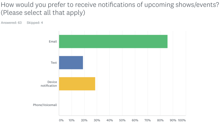
We surveyed over 60 individuals with basic questions about their shopping and live event habits. We hoped to use this information to help inform our brainstorm and ideation, along with our competitive research.
Ultimately, our findings confirmed that:
People purchase their tickets online.
Most search, specifically, by team or artist, but there is a large contingent of customers who browse for local events.
The current online purchasing method is still to go directly to a website, however, there is a growing trust in mobile applications.

Interviews & Affinity Maps
We identified some power users from our screener survey and asked them to share some additional thoughts on their experiences. Questions included:
Tell me about the last time you purchased a ticket for an event?
How did you learn about the event?
What other methods have you used to purchase your tickets?
Have you used Fandango?
Have you ever resold tickets or purchased tickets from a reseller?
We, then, summarized these responses in an affinity mapping session to identify the major points for us to focus on in our design.

Personas
We created three Personas based on our interviews and survey results. A concertgoer, sports fan, and event browser. We would rely on these personas over the course of the rest of our design process.


Users Needs
Armed with our research and interview information, we brainstormed and identified the following list of wants and needs that, we felt, meant the most to our customers.
Minimal and Clean Setup and Information Architecture
Simple-but-powerful Filter
Stay connected with current events
Link to Existing Fandango Membership
Light Registration
Transfer tickets function
Favorite/Save for later options
Accessible seat view function

Sitemaps
As our goal was to add to the existing Fandango application, rather than create an entirely new app, we began with our estimation of the existing sitemap. We, then, began to add our new features and operations in.
Minimal and Clean Setup and Information Architecture
Simple-but-powerful Filter
Stay connected with current events
Link to Existing Fandango Membership
Light Registration
Transfer tickets function
Favorite/Save for later options
Accessible seat view function

Orginal Sitemap
Validation
Using feedback from the high-fidelity prototype, we again iterated, modifying the home page to address an identified concern regarding task completion (easy access to purchased tickets).
Wireframes and Prototype


Updated Sitemap
User flows, Sketching, Journey mapping
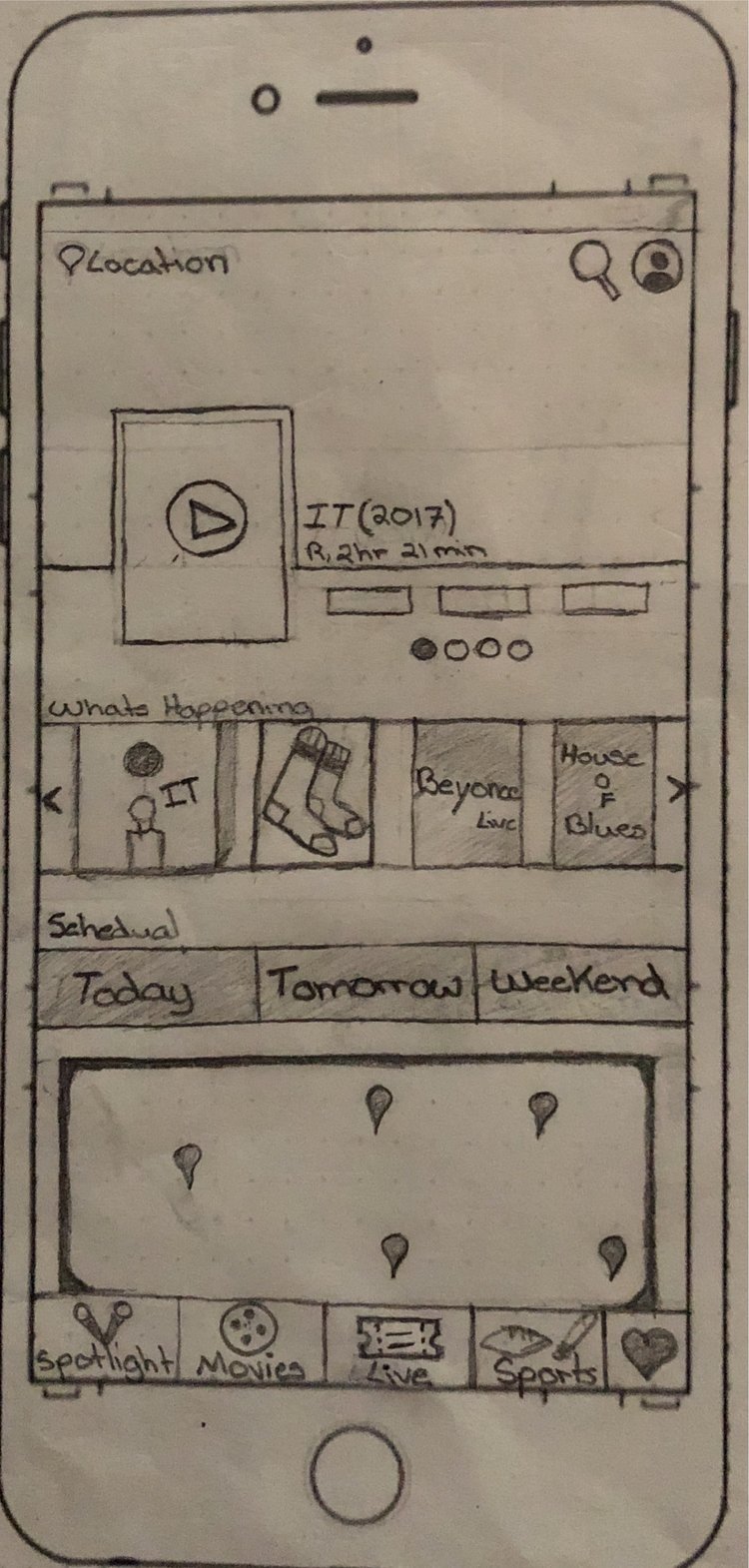
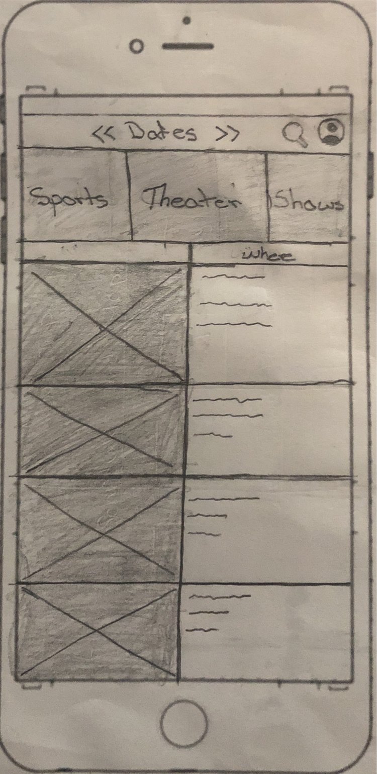
With the sitemaps taking shape, we dove into drawing out ideas for page layouts, global navigation and how we envisioned our users experiencing the app.

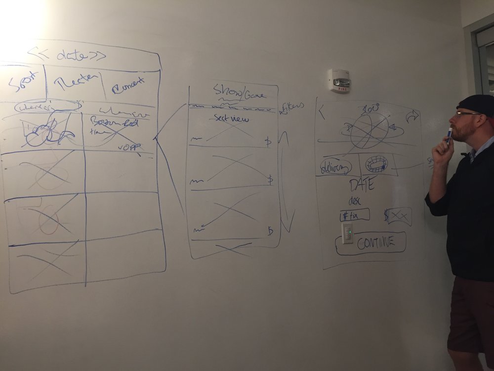


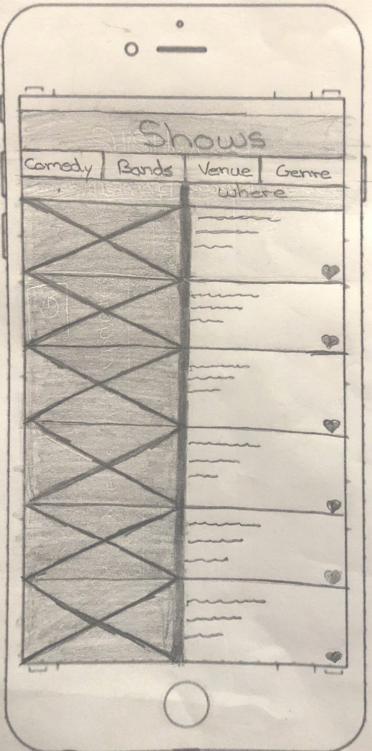
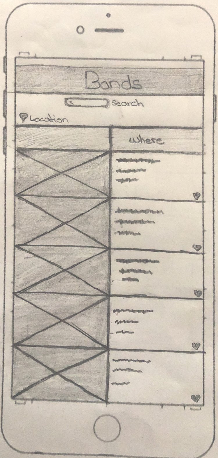
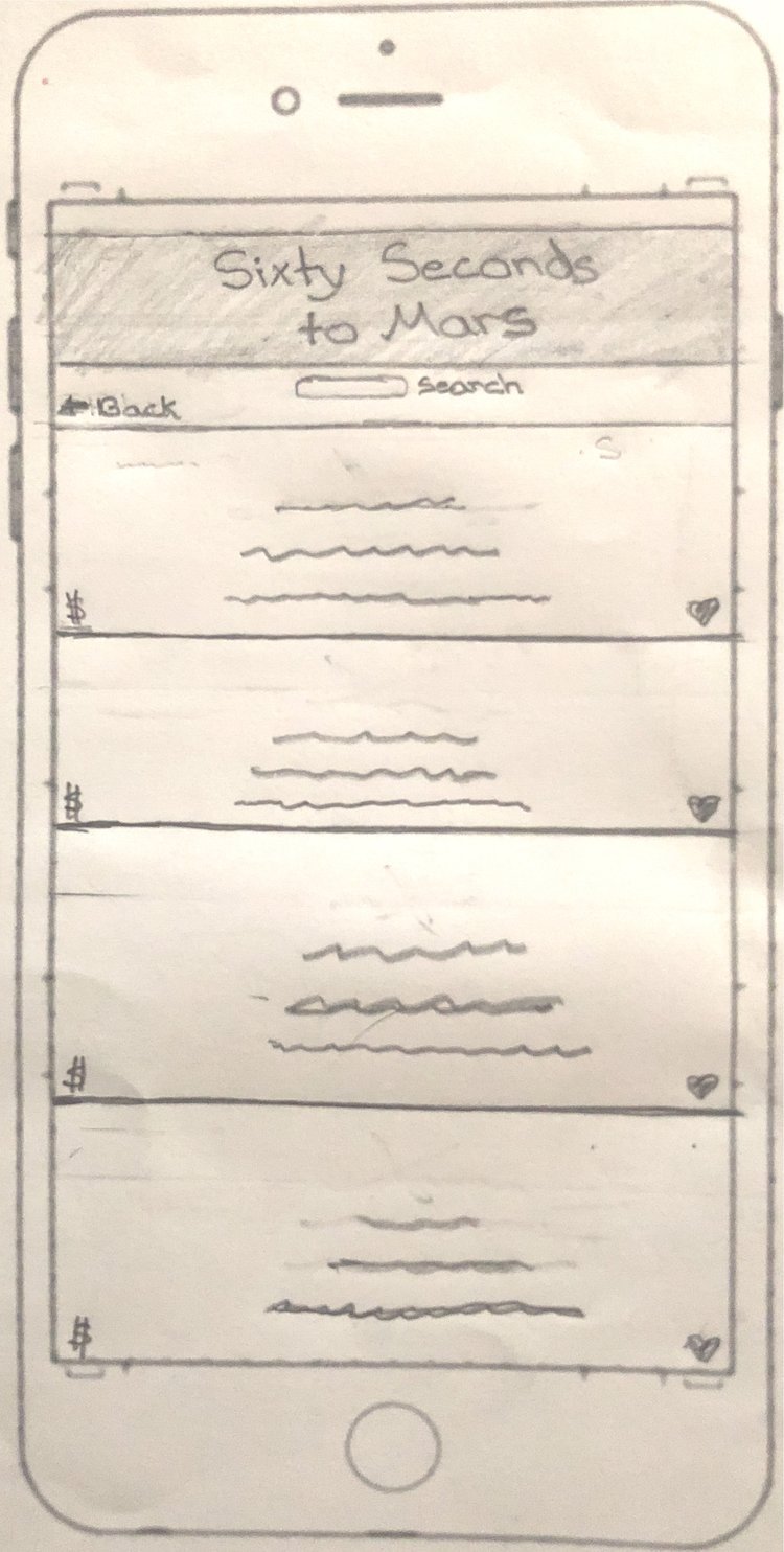
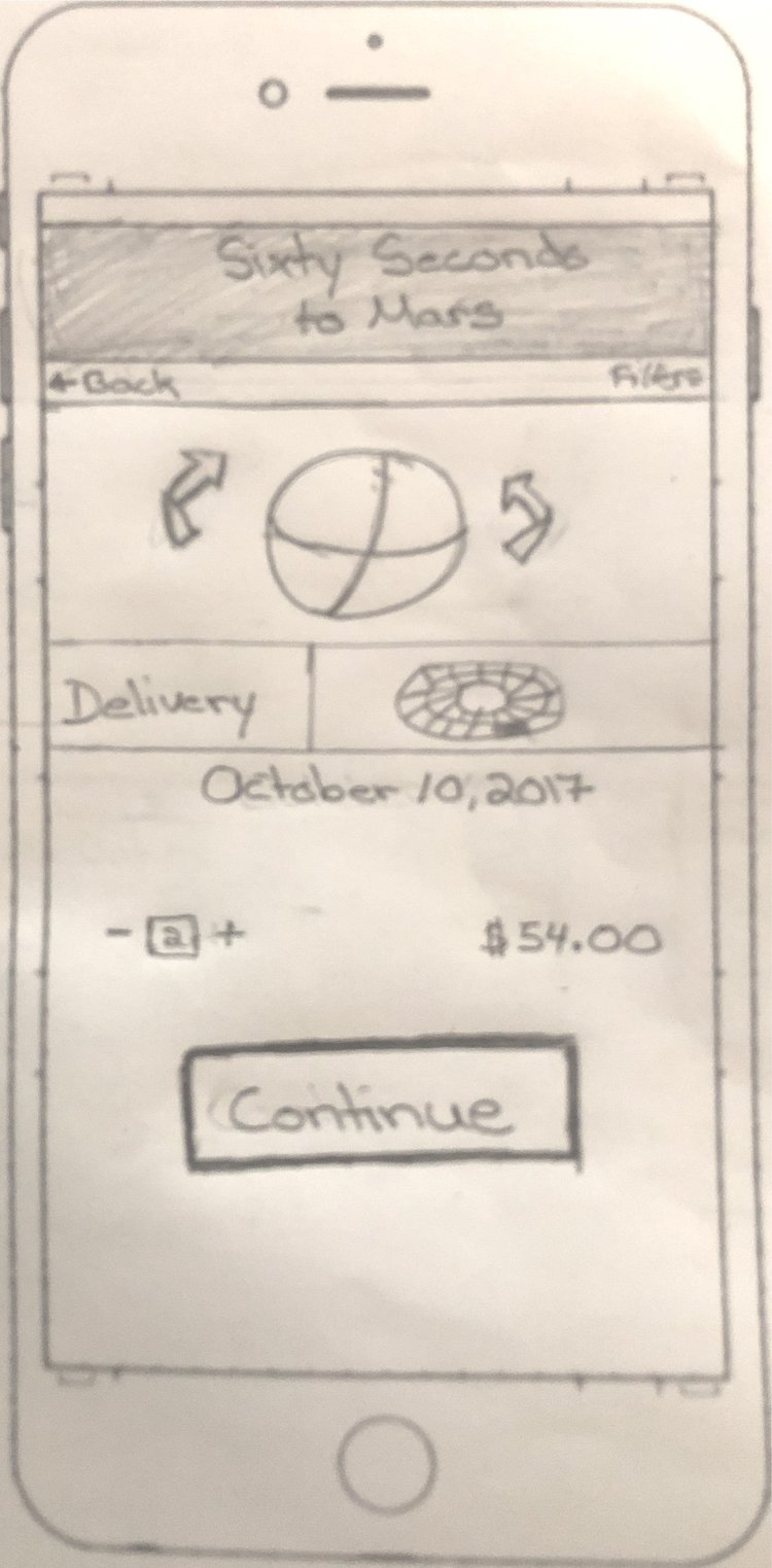
Low-Fidelity Wireframes
We produced a complete flow for use as a paper prototype, which we, then, put in front of a number of users seeking feedback.
Usability Testing
Our users provided invaluable feedback that we were able to translate into solid iteration and informed our high-fidelity Sketch and Invision prototype. The users indicated that they felt the design was clean and easy to use, with a few observations about the global nav and a checkout flow question.
The most meaningful feedback, however, was regarding the user flow to retrieving purchased tickets. Customers wished they could access their purchased tickets more efficiently.
After some additional discussion and iteration, we went back to the prototype and changed the global nav on the homepage to include a direct link to the customers' tickets. The new flow is demonstrated on the right.
System Usability Scale
In addition to asking for our users' feedback on our prototype, we asked each one to fill out a SUS form. The data from this scale validated our design choices, but allowed for room to grow.
High Fidelity Prototype
The video, here, demonstrates a full user flow from start to concert tickets. If you'd like to see more, please contact me!
Conclusion

This was an exciting project to work on, as we were able to envision a better solution to a process that many of us have dealt with, personally: Live show and sporting event ticketing. The idea of rolling all of that into the clean and easy-to-use interface of Fandango's movie ticket process is an attractive prospect.
That said, this presents some significant challenges, which we were forced to set aside for future development. These steps include:
Social Media/Music app integration
Sync with Spotify, Facebook, etc for event notifications and suggestion
User-generated content
Venue reviews, etc.
A more complete refinement of the browsing and event presentation process.
Clearer presentation of show tickets
Camera-based scanning for event look-up
User takes picture of poster/billboard/ad and is automatically directed to the event page